Andy Chadwick* and Paul Williamson~ explain how interaction between continuous trend with natural climate cycles produces the observed stepped pattern of global warming
Climate-change ‘sceptics’ have made great mileage out of the current hiatus in observed global warming. Atmospheric temperatures have not really increased since the turn of the 21st Century, a fact frequently cited as incompatible with, or even disproving, global warming. These same commentators draw a discreet veil over the fact that temperatures also didn’t rise between 1940 and 1970 - an inconvenient truth for them, since that pause was followed by 30 years of rapid warming.
However, the truth is that a long‐term rising temperature trend, steepening with time, has lifted average global temperatures by around 0.9° C since the early 20th Century. This long‐term trend correlates closely with the rise in atmospheric CO2 and with its expected greenhouse warming effects. But anthropogenic emissions are not the only game in town, and that is why the observed temperature variation is more complex.
The basic picture of long‐term warming is in fact characterised by thirty‐year ‘ramps’ (where temperatures rise relatively quickly), alternating with thirty‐year ‘flats’, where temperatures either fall slightly, or remain roughly constant. The latest ‘flat’ commenced around the year 2000.
It is relatively easy to set out, simply and without complex modelling, the way in which global temperatures and atmospheric CO2 concentrations have changed over the past century and more. By teasing apart the different natural, shorter-term variations that affect the atmosphere, we can show quite clearly why we should not expect temperature increases to be as smooth as the rise in CO2 content, and how it is that the interference between the steady curve and the different cyclicities produces just the stepped graph that is observed. From there we can make predictions of how temperatures are likely to change over the next 50 years or so, assuming these patterns continue.
It was Swedish physical chemist Svante Arrhenius (1859-1927) who wrote1 in 1896 that “…..if the quantity of carbonic acid [in the atmosphere] increases in geometric progression, the augmentation of the temperature will increase nearly in arithmetic progression”. Arrhenius rather welcomed the idea of global warming and optimistically predicted that Scandinavian climates might become more equable. Although our understanding of how climate is affected by different greenhouse gases has become much more sophisticated since then, Arrhenius’s basic thesis still stands today.
Datasets
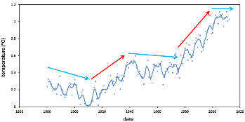 A number of long‐term global temperature datasets exist and are publicly available. Some are restricted to measurements taken on land2 and others covering the entire Earth’s surface3. Here we use the NASA database4 , available in tabular form online. The dataset comprises temperature measurements from 1880 to the present day expressed as temperature difference relative to the 1951‐1980 mean. Here, for clarity, we redisplay them as temperature difference relative to the lowest recorded annual value (in 1909) <Figure 1>.
Figure 1: Global temperatures from NASA (2014), showing measured annual values (crosses) and values smoothed with a 3‐year moving average filter (solid line), plotted relative to the 1909 minimum value. Arrows denote prominent ‘flats’ (blue) and ‘ramps’ (red) in the overall temperature trend.
The raw data are quite noisy, with significant year‐to‐year variation, so a simple three-year moving average filter has been applied to smooth these out and make it easier to see the overall variability.
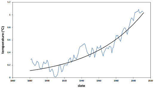 The most obvious aspect of the dataset is a hundred‐year warming trend, from the early part of the 20th Century to the present day. This can be illustrated by fitting a simple power‐law curve to the data <Figure 2>. As defined by the power‐law fit, global temperatures today are some 0.8 – 0.9°C higher than they were during the latter part the 19th Century.
Figure 2: Smoothed global temperatures with best‐fit power‐law curve to show long‐term trend. Atmospheric CO2 levels Data on CO2 levels comprise online measurements from the modern instrumental record5 combined with online measurements from older periods gathered from inclusions in ice‐cores from the Antarctic ice‐sheet6.
Measured annual temperatures do not follow the long‐term trend exactly, but rather include a number of pronounced multi‐decadal variations. These are characterised by ‘ramps’ (periods of roughly 30 years when temperatures rose rather rapidly) and ‘flats’ (periods of roughly 30 years when temperatures decreased slightly or remained roughly constant).
Thus, and running counter to the overall warming trend, temperatures fell significantly between 1880 and 1910, decreased slightly in the 30-year period 1945 to 1975, and have remained roughly constant since the end of the 20th Century to now. Viewed in this context, the current ‘flattening off’ of global temperatures seems to be part of a rather regular pattern.
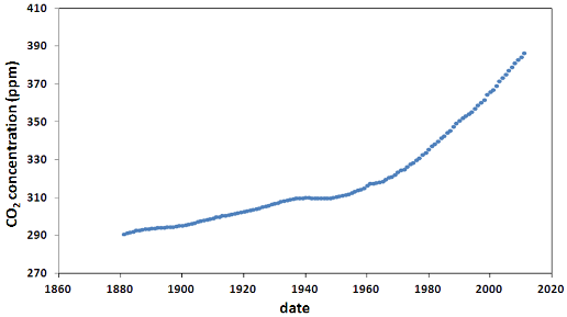
Figure 3: Atmospheric CO2 levels 1880 to 2012 based on ice‐core data from Law Dome Antarctica 6 and Mauna Loa5 (Scripps 2014).
CO2 data show a significant increase, from around 290ppm at the end of the 19th Century, to nearly 400ppm by the present day (CO2 levels at Mauna Loa observatory (Hawaii) reached 400ppm for the first time on 9 May, 2013). Like the long‐term temperature trend, the rate of CO2 increase is not itself constant, but accelerates steadily with time. In general terms, it is clear that with time (particularly in the second half of the 20th Century), higher atmospheric CO2 concentrations are associated with higher temperatures.
Correlations
Cross‐plotting CO2 levels and temperature shows a direct correlation <Figure 4>. The simplest fit to the data is a simple linear function, with a gradient of around 0.1 °C for every additional 10ppm of CO2. Other, more complex, fits can be made. For example, a logarithmic function gives an equally satisfactory correlation.
Applying the two correlation functions to the CO2 observational record gives equivalent ‘CO2 – scaled’ temperature records <Figure 5>. These two scaled curves essentially represent the component of the observed temperature record that correlates with CO2, and excludes any shorter term variability.
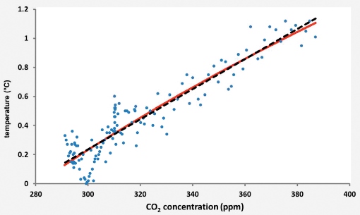
Figure 4: Global temperatures plotted against atmospheric CO2 levels (1880 – 2012) showing a linear fit (dashed black line) and a logarithmic fit (solid red line).
These curves also include the effect of other greenhouse gases that have also accumulated in the atmosphere, over similar timescales to CO2 – methane, for example. For simplicity we shall just use the term ‘CO2‐scaled’ temperatures.
CO2‐scaled curves produce a match to measured temperature data that is much superior to the empirically‐fitted power‐law curve <Figure 2>. This is quite remarkable, given that the power‐law curve is derived purely from the temperature data, whereas the scaled curves depend on the relationship between CO2 and temperature.
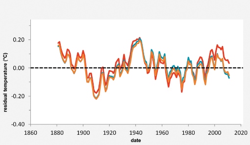
Short‐term temperature variation can be isolated by subtracting long‐term trends from the observed data, to obtain ‘de‐trended’ or ‘residual’ temperatures <Figure 6>. These residual temperature variations have no correlation with CO2 and so can be thought of as a response to natural or other shorter‐term processes.
By simply looking at the curves, one can discern a number of cyclical components. The strongest of these by far has a periodicity of around 60 years and corresponds to the obvious ‘multi‐decadal cyclicity’, which has a variability approaching ± 0.15°C, with peaks around 1880, 1940 and 2000 and troughs around 1910 and 1970 <Figure 6>. Smaller, shorter‐term components seem to display periodicities in the range of five to 20 years or so, contributing decadal variations in the order of ± 0.01°C.
Spectral analysis provides a more rigorous way of determining cyclical variations within time series like these. Application of a Fast Fourier Transform (FFT) to the residual temperature curve (obtained after subtracting the logarithmic fit between CO2 and temperature) gives the power spectrum shown in Figure 7.
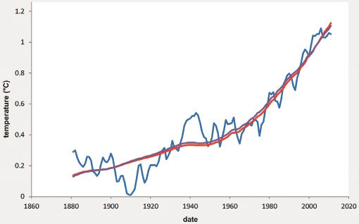
Figure 5: Observed temperatures (solid blue line) and CO2‐scaled temperatures using the linear (red line) and logarithmic (purple line) temperature – CO2 correlation functions from Figure 4.
The peaks in the spectrum indicate the presence of discrete cyclical components. In fact, the peaks are all distributed across several frequencies - so we compute the ‘true’ frequency as the weighted average of those frequencies comprising the spectral peak. The reason for doing this is that a spectrum computed by FFT is evaluated at frequencies fixed by the sampling frequency and the number of samples in the data sequence. So, for our input sample size of 131 years (with sampling every year) the periods of the first three frequency components are: infinity (by definition, the constant term), 131 years, 65.5 years and 32.75 years (i.e., the period halves with each successive spectral estimate).
The weighted averaging helps compensate for the effect of undersampling, which is most important at the low-frequency end of the spectrum, where gaps between adjacent periods are largest. By taking weighted averages of the frequencies that make up peaks A, B and C <Figure 7>, we determine periods of 59.9, 20.3 and 14.6 years respectively.
The phases of the three cyclical components were similarly estimated by averaging the individual phases of spectral components making up the peaks in the power spectrum, weighted by their respective powers. Smaller peaks in the spectrum (associated with cycles of less than 10 years) were not considered.
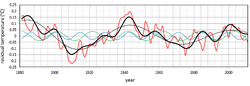
A synthetic curve, incorporating the three principal cyclic components, is shown in Figure 8, using the identified frequencies and phases of the principal spectral components. This captures well the multi‐decadal variations in amplitude of the observed temperature residuals. (We have not included higher frequency components from the spectral analysis, partly for simplicity, but also to avoid giving a false impression of precision when extrapolating the data into the future).
 Close match
Figure 6: Residual global temperature variations 1880 – 2012 derived by subtracting the long‐term trend curves from the observed data. Residuals from the power‐law fit and the linear and logarithmic scaled trends are denoted by the red, blue and brown lines respectively.
It is clear that the long‐term warming trend extracted from temperature data closely matches the observed rise in atmospheric CO2 concentrations. In particular it matches well the temperature trend scaled from the logarithm of CO2 concentration - the relationship first proposed by Arrhenius.
The shorter term variations correlate with a number of natural oceanic circulation phenomena, all of which are associated with enormous heat exchanges between the oceans and the atmosphere7. The dominant ~60 year temperature periodicity is comparable with a 60‐year cyclicity in global sea level8 and is correlated with the Atlantic Multidecadal Oscillation9. Other shorter‐term cyclic phenomena further complicating the record include the Pacific Decadal Oscillation and the more notorious ‘El Nino’.
Additional, non‐cyclic events all add ‘noise’ to the longer‐term temperature record. Of these, the most important natural process is volcanicity, which produces dust and atmospheric aerosols that act as transient cooling agents. Human activity is also variable in the short term, notably in the production of aerosols and carbon particulates. It seems the 11‐year sunspot cycle has no discernible imprint on the temperature record.
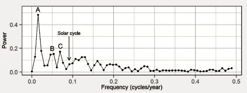
Figure 7: Power spectrum of the residual temperature variation showing distinct peaks at several frequencies. The largest components (peaks A, B and C) are associated with periods greater than 10 years and have estimated cyclicities of 59.9, 20.3 and 14.6 years respectively. We also indicate where the 11‐year solar cycle would plot on the spectrum.
For simplicity, we shall refer to all these non‐CO2 related multidecadal/decadal temperature effects as ‘natural’ variation.
Ramps and flats
The prominent ‘ramps’ and ‘flats’ in the temperature curve can readily be explained as the interaction between the long‐term warming trend (steepening with time) and the dominant ~60-year cyclic variability <Figures 5 and 6>.
Thus from ~1880 to ~1910, the still relatively gentle long‐term rising trend (of 0.03°C per decade) was outweighed by a fall (of 0.13°C per decade) in the ‘natural’ cycle to produce an overall cooling over 30 years of about 0.3°C.
From ~ 1910 to ~1940, the long‐term rising trend (by then increased to 0.04°C per decade) was enhanced by a 30-year (0.12°C/decade) rise in the ‘natural’ cycle, to produce a ramp in temperatures of about 0.5°C in 30 years.
From ~ 1940 to ~1975, the long‐term rising trend (now up to 0.07°C per decade) was just outweighed by a 35-year (0.09°C per decade) fall in the ‘natural’ cycle - to produce a slight cooling over 35 years of 0.07°C.
 From ~1975 to ~2000 the long‐term rising trend (which by that time had reached 0.12°C per decade) was enhanced by a 25-year (0.08°C per decade) rise in the ‘natural’ cycle, resulting in an increase of over 0.5°C in 25 years - the fastest rise yet recorded.
And so, from 2000 to the present, the latest downswing in the natural cycle is just about balancing the rapid underlying upward trend.
Figure 8: Synthetic time series of temperature residuals (thick black) reconstructed from three sinusoidal frequency components corresponding to the spectral peaks in Figure 7 associated with periods of 59.9, 20.3 and 14.6 years (denoted by the thin black, green and blue lines resp.). The observed temperature residual is shown in red. A linear decay of amplitude with time has been applied to the lowest frequency component.
Looking ahead
What are the implications of this for future global temperatures, assuming continued increase in atmospheric CO2?
The first step is to extrapolate the synthetic residual function forward by 50 years or so. This has been accomplished by extrapolating the three sinusoidal frequency components (with periods of 59.9, 20.3 and 14.6 years) to around 2070, and summing them <Figures 9, 10>.
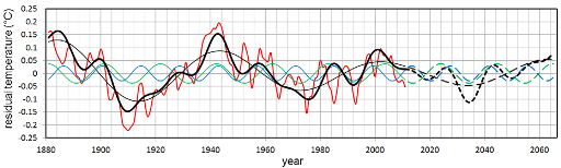
Figure 9: Synthetic and observed residual temperatures time series as for Figure 7 but with the synthetic components extrapolated into the future (dashed lines).
The second step was to project forward the long‐term rising temperature trend, scaled from the logarithm of CO2 concentrations. To do this, we assumed that atmospheric CO2 would rise at a constant increment of 1.69ppm per annum <Figure 10> - the average value from 1990 to 2012. (Recent yearly increases suggest that this might be rather conservative.)
Summing the projected synthetic residuals and the projected long‐term trend gives a synthetic temperature curve that provides an estimate of future global temperature <Figure 10>. It is clear that in coming decades temperatures will continue to rise, albeit not at a uniform rate.
The latest down-swing of the ~60 year cycle, which started around the turn of the century, will probably restrict average global temperature-rise to around 0.1°C per decade until around 2035; but this will increase to around 0.2°C per decade as we enter the next ‘ramp’.
Clearly this is just an estimate and subject to uncertainties. Take, for instance, short‐term variation. As discussed above we have not included cyclicities with periods of less than about 15 years, mainly to avoid a false impression of precision in the forward projection. Our temperature curve cannot therefore capture this type of variability. Thus, while our curve indicates the general warming slowdown that we have witnessed since 2000, it does not accurately replicate the actual flattening, which would require the addition of shorter‐term variables.
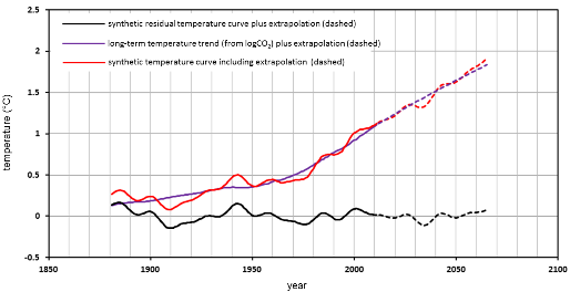
Figure 10: Future projection of temperature trends, showing the synthetic temperature residuals (1 ‐ black), the long‐term temperature trend (2 ‐ purple), and the synthetic temperature curve (sum of 1 and 2).
Our analysis shows that the ~60 year periodicity is the key factor, which we interpret to be mainly responsible for the prominent ramps and flats observed in the recent temperature record. The evidence runs to just over 130 years of data however - barely more than two complete periods; so the longer‐term stability of this cycle is open to question. Rohde et al. produced a temperature record back to around 175010. The ~60 year periodicity is discernible on this, at least as far back as the early 1800s; but before this the record becomes increasingly uncertain.
Conclusions
Our analysis shows a number of interesting patterns and interactions in the global temperature record. A long‐term rising trend, steepening with time, has lifted global temperatures by around 0.9° C from the early part of the 20th Century. Superimposed on this, a decadal to multidecadal cyclic variability imposes shorter‐term temperature variations in the order of ±0.15°C.
The long‐term rising trend correlates closely with the rise in atmospheric CO2 and with its expected greenhouse warming effects. The shorter‐term cyclic variability is a ‘non‐greenhouse’ effect, influenced by some aspects of human activity, but principally the result of natural processes - in particular, large‐scale multi‐decadal to decadal oscillation of the oceanic circulation system.
Taken together, natural cyclic variation and the underlying rising trend produce the observed global temperature curve. When natural cyclicity acts against the greenhouse trend we get a temperature ‘flat’, while when the two act in unison we get a temperature ‘ramp’. The ramps are getting steeper with time, and the flats (which were initially characterised by cooling) are no longer.
Projections suggest that CO2‐driven warming will continue, initially ameliorated by the current down-swing in natural cyclicity. However as this unwinds, temperature increase will accelerate from around 2035. Shorter–term variability might disguise these trends for periods of a few years or so.
There is a significant chance therefore that the current warming ‘hiatus’ might continue for a number of years. But it is critically important that this is not allowed to derail climate-change policy. The current hiatus is not ‘buying us time’ in any sense. As the natural cycle unwinds, and we enter the next ramp, excess energy stored in the oceans will be released back into the atmosphere, and temperatures will rise again - in all probability, more quickly than before. The climate change consensus11 is not threatened by the current apparent lack of global warming.
References
- Arrhenius, S. 1896. On the influence of carbonic acid in the air upon the temperature of the ground. Philosophical Magazine and Journal of Science. Series 5, Volume 41, April 1896, pages 237‐276.
- Rohde, R., Muller, R.A., Jacobsen, R., Muller, E., Perlmutter, S., Rosenfeld, A., Wurtele, J., Groom, D. & Wickham, C. 2013. A new estimate of the average earth surface land temperature spanning 1753 to 2011. Geoinformatics & Geostatistics: An Overview, 1:1. SciTechnol 2013.
- Morice, C.P., Kennedy, J.J., Rayner, N.J. & Jones, P.D. 2012. Quantifying uncertainties in global and regional temperature change using an ensemble of observational estimates: The HadCRUT4 dataset. Journal of Geophysical Research, 117, D08101, doi:10.1029/2011JD017187.
- Hansen, J., M. Sato, R. Ruedy, K. Lo, D.W. Lea, and M. Medina‐Elizade, 2006: Global temperature change. Proc. Natl. Acad. Sci., 103, 14288‐14293, doi:10.1073/pnas.0606291103.
- Scripps. 2014. Mauna Loa in situ CO2 data. http://scrippsco2.ucsd.edu/data/atmospheric_co2/
- Etheridge, D.M., Steele, L.P., Langenfelds, R.L., Francey, R.J., Barnola, J‐M. & Morgan, V.I. 1998. Historical CO2 record from the Law Dome DE08, DE08‐2 and DSS ice cores. http://cdiac.ornl.gov/ftp/trends/co2/lawdome.combined.dat
- Kosaka, Y. & Shang‐Ping, X. 2013.Recent global‐warming hiatus tied to equatorial Pacific surface cooling. Nature. Doi:10.1038/nature12534.
- Chambers, D.P, Merrifield, M.A. & Nerem, R.S. 2012. Is there a 60‐year oscillation in global mean sea level? Geophysical Research Letters, Vol. 39, L18607, doi:10.1029/2012GL052885.
- Delworth, T. L. & Mann, M. E. 2000. Observed and simulated multidecadal variability in the Northern Hemisphere, Climate Dynamics, 16, 661–676, doi:10.1007/s003820000075.
- Rohde, R., Muller, R.A., Jacobsen, R., Muller, E., Perlmutter, S., Rosenfeld, A., Wurtele, J., Groom, D. & Wickham, C. 2013. A new estimate of the average earth surface land temperature spanning 1753 to 2011. Geoinformatics & Geostatistics: An Overview, 1:1. SciTechnol 2013.
- IPCC, 2013: Climate Change 2013: The Physical Science Basis. Contribution of Working Group I to the Fifth Assessment Report of the Intergovernmental Panel on Climate Change. Stocker, T.F., D. Qin, G.‐K. Plattner, M. Tignor, S.K. Allen, J. Boschung, A. Nauels, Y. Xia, V. Bex & P.M. Midgley (eds.). Cambridge University Press, Cambridge, United Kingdom and New York, NY, USA, 1535 pp.
* Dr Andy Chadwick is Individual Merit Research Scientist: CCS (Carbon Capture & Storage) with the British Geological Survey. E: [email protected].
~ Dr Paul Williamson is Research Geophysicist at British Geological Survey. E: [email protected]