The UN's Intergovernmental Panel on Climate Change (IPCC) is currently considering how it will undertake its sixth Assessment Report. With each Assessment getting ever bigger, perhaps now is the time to get back to basics?
IPCC is currently gearing up to undertake its 6th Assessment Report (AR6). Since the first Assessment Report (FAR) in 1990 (pictured, left), each has built on the previous almost additively to the extent that in a very real sense the IPCC is experiencing bloat. The Working Group I report (WGI) is the one that deals with the science and this in turn underpins its WGII and WGIII reports that relate to impacts and mitigation respectively. The FAR WGI report was a large format, 450 page document. Each of the subsequent WGI reports was larger so that by 2007 and AR4 it had topped 1,000 pages; by the time of AR5 (2013) it was over 1,500! Yet despite its size – so great that arguably now only the most dedicated of researchers read it all – key questions are not addressed clearly. Among these, I contend, are those that relate as to how our understanding of where the climate system is going is changing.
For example, policy makers – and I know also some non-climate scientists –not only want to be aware of the latest science (which the IPCC does cover and for the most part well), but importantly how our understanding has changed over the years (now for the best part of three decades): stating the current state of play does not by itself do this. For instance, compared to the 1990 FAR, is our present trajectory assuming we do nothing likely take us into a better (less warmer than was thought) or a worse a world than considered three decades ago in the FAR? And does our present understanding mean that we have to put in more, or less, mitigation effort than envisioned in the 1990 FAR to stabilise warming, or even to meet the aspirations of the 2015 Paris Accord?
Sadly, the former fundamental question is hard, if not impossible, to easily elucidate from recent Assessments' WGI reports. While the latter question will not be straightforwardly answerable in the forthcoming AR6 without direct comparison to the 1990 FAR.
The problem is not that we do not have a better handle of where emissions are likely to take us. The IPCC emission scenarios have evolved: we have gone from FAR's WGI four scenarios of a business-as-usual (BaU) and three other scenarios future emissions to determine the likely resulting warming, through (in IPCC speak) the IS92 scenarios, the SRESs (Special Report on Emissions) family of scenarios, and with AR5 the RCPs (Representative Concentration Pathways). All well and good, but how on Earth do their outcomes compare with their counterparts: how does, say, the current high RCPs compare with the 1990 BaU?
Here you might think that the answer lies in one or more of the most recent WGI reports' colourful graphs. Alas not. Yet a comparison graph or two would be the simplest way to make such a comparison without significantly adding word count and further IPCC bloat.
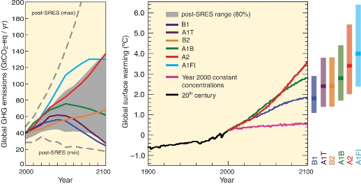 Graph right:
 IPCC 2007 Future warming scenarios to 2100
What has happened with recent Assessments is that no direct comparison has been made: you cannot even simplistically overlie the current warming depiction graphs with their counterparts from previous WGIs due to shifting IPCC depictions. Here, the least of our worries is because the Assessments' warming reference years have changed. In the 1990 FAR in the relevant graphs it was warming compared to the planet's 1765 temperature (taken as the pre-industrial revolution base year). For the 1995 SAR it was warming above 1990. In the 2001 and 2007 WGIs it was further refined to warming above the effective average temperature in the years before and after 1990 (which did have the virtue of being the reference year in the UN's Framework Convention on Climate Change); and in 2013 WGI for AR5 it was warming above the effective average temperature in the years before and after a theoretical 1995 temperature (actually the average temperature over the years 1986 to 2005).
Also, the various Assessments' scenario warmings run from different years. In the 1990 FAR the scenario temperatures ran from the year 1850 to 2100. In the 1995 and 2001 WGIs it was from 1990 to 2100, in the 2007 WGI it was from 2000 (with actuals or proxy estimates from 1900 to 2000), and in the 2013 WGI, in different places the scenarios were graphically presented as running between 2000 and 2100 as well as 2005 and 2100.
Confused? Well, you'd be forgiven for being so.
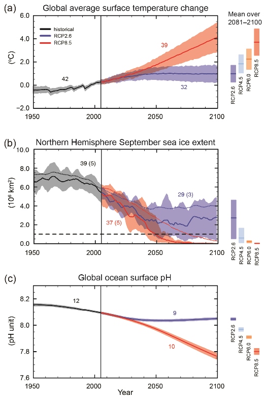
Graph left: IPCC AR6 2013 Fig SPM-07 Future warming scenarios
Pity then, non-scientists such as policy makers trying to come to grips with how IPCC perceptions are evolving.
Way back in school, our science teachers kept banging on about standardisation when comparing results in a like-with-like way. I feel that the IPCC has lost sight of this in an attempt to present the most contemporary view. Yet we can have both: we can present the latest perspectives but in a basic graphical format previously used or portray previous Assessment analogous scenarios on the same graph. Here I'm with our school science teachers: I feel it would be useful, and something that policy makers and others would welcome, that if in addition to whatever else it does, the next Assessment has at least one graph that compared the various IPCC analogue 1990 BaU perceptions across all its Assessments. It might depict the 1990 FAR BaU warming graph (and its upper and lower envelope) covering the years 1850 to 2100 with 0˚C warming temperature set to 1765, and then superimpose the subsequent five Assessments' WGI scenarios that are most closely analogous to the 1990 BaU together with the proxy and measured real temperature up to 2020 (before the likely academic cut-off for AR6).
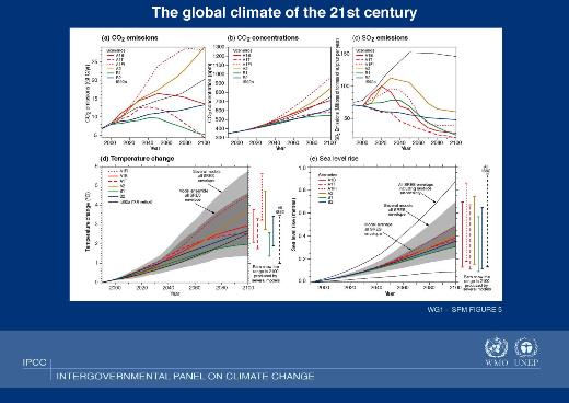 Graph right:
 TAR IPCC 2001_SPM5 - The global climate of the 21st Century
This way, in a single diagram, comparing like-for-like, we can begin to answer the questions posed earlier. Let's have at least one or two standardised views of parameters of interest across all the IPCC assessments. (Sea level rise is another area of interest in addition to anticipated warming.) If nothing else we may find that the various Assessment's BaU warming analogues are all within the upper and lower envelope that the IPCC forecast in 1990 (I have done such a back-of-an-envelope graph for my own benefit). Such diagrams would also enable us to get a feel for whether the IPCC's perceived consequences of doing nothing has increased or decreased over the past three decades. Such a perspective might even galvanise policy makers into more robust action.
 Author
Jonathan Cowie (right) has had a career with learned scientific societies and professional bodies. His
Climate Change: Biological and Human Aspects (2nd edition) is available from Cambridge University Press. He can be found
online.