Design choices play an important role in how volcanic hazard maps communicate risk. Ian Randall* reports.
 Probabilistic volcanic hazard maps display, for a chosen area and time frame, the modelled likelihood of dangerous volcanic phenomena, like ash falls or lava flows. Recent improvements in computing capacity and the growing number of probabilistic approaches to hazard analysis are making these maps an increasingly significant part of volcanic risk management. Drafted by researchers, the maps are disseminated to stakeholder parties, including government, emergency management, aviation, agriculture, etc. – after which they are used to inform a variety of emergency-related decisions.
End-user
It is important, therefore, that the map be successful in communicating the hazard it was intended to depict – especially in time-sensitive, crisis situations where decisions are made based on rapid impressions of perceived hazard. Together, the complicated nature of probabilistic hazard data and the variety of design choices available for presenting them means that each dataset can be portrayed by many different maps – not all of which, however, may convey the desired message to the end-user.
“Even if you get great data, that doesn’t mean anything unless people use it, understand it, and are confident with it,” says Mary Anne Thompson, who studies volcanic hazards at the University of Auckland. With scientists’ general focus on methodology and data, she explains, little attention has been given to the role of communication in volcanic hazard research. To address this, a new study by Thompson and her colleagues has investigated how map users from New Zealand – both other scientists and decision-making stakeholders - perceive the impact of some of the map design choices that are available.
Their research was conducted in two stages, with a small series of face-to-face interviews (with four volcanologists and 10 stakeholders) forming a pilot study which informed a subsequent survey, distributed to a larger number of participants (110 in total, with 32 scientists and 78 stakeholders.) In both, participants were asked to consider a series of maps – based on a shared dataset – that displayed a selection of design choices, including different classification schemes (e.g. binned, shaded or isarithmic); colour schemes; phrasings in the map’s key, and supplemental hazard curves.
The researchers chose ash-fall as their hazard to map, given its prominence among volcanic hazards and its potential for widespread and diverse social impacts. Ash-fall is a common target for probabilistic analysis, given the need to consider the impact of variable atmospheric conditions on its spread.
Eruption
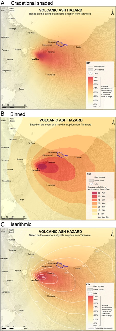
The demonstration maps used in the study depicted the probability of accumulating a set thickness of fallen ash from a hypothetical eruption at Mount Tarawera, an active rhyolitic volcano that lies south-east of Lake Rotorua, in the middle of New Zealand’s North Island. Part of the larger Okataina Volcanic Centre, Tarawera is well-known locally, having had two recent eruptions: one around 1315, and another in 1886. The latter – which is believed to have ejected around two cubic kilometres of material – caused over 100 fatalities and resulted in an ash fall whose impact was felt as far as Christchurch, 800 kilometres away. “Over the last 26,000 years that area has had maybe 10 significant ash fall events,” says Thompson. “It’s important to build hazard models for it because it could happen again in the future.”
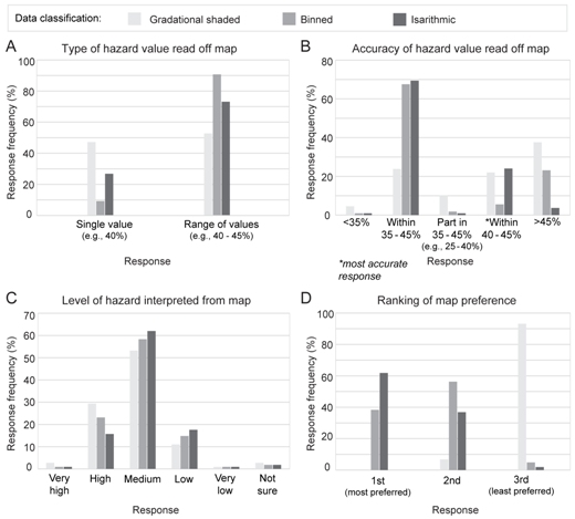
Looking at the classification of map data, the main concerns that emerged from the participants centred on ease of reading, precision, aesthetics and the realistic representation of hazard. Binned classification schemes were seen as being ‘too stepwise’, while the gradational shading was seen as best for depicting the change in ash-fall moving away from the vent. At the same time, however, the grading was also seen as being too challenging to interpret with certainty – unless isopleths were also present. Isopleths at 10% intervals were favoured over those at 5%, which were viewed as being misleadingly precise. Background content was appreciated for map orientation, and participants preferred maps on which the mapped hazard was not cut short by political boundaries.
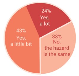
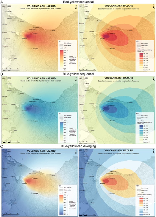 Colour schemes (right) were reported to affect the perception of hazard levels among 67% of participants. The two most popular schemes were the red-yellow sequential colour scheme – also favoured by most scientists – and the diverging red-yellow-blue scheme, favoured by the majority of stakeholders. Red colours were noted as carrying connotations of ‘danger’ and ‘volcanoes’, while blue was seen as relating to the absence of hazard – with the potential therefore to create misleading impressions of safety or underestimated hazard. In addition, blue shades offered the potential for confusion with other types of hazard map, especially flooding maps. Several participants in the interview portion of the study also raised concerns about the difficulty that colour-blindness causes in reading maps with certain colour schemes.
Threshold
The participants displayed no significant preference between maps showing a fixed ash threshold (i.e. probability of a given depth of ash coverage) versus a fixed probability threshold (i.e. the distribution of ash at a given probability). Despite this, stakeholders did express a distinct desire for a low ash threshold, when used. While the pilot study set the threshold at 10 millimetres of ash (an often-used value in scientific literature, and which would result in significant disruption) the stakeholders preferred instead to know if there would be any ash at all, this being a more useful trigger for action in response (e.g. clearing ash from roads).
As a supplement to the maps, most survey participants found both extra information (about the volcano, probabilistic hazard and possible impacts of ash fall) and also hazard curves to be useful additions. The hazard curves were more popular among scientists than stakeholders. Of the two curve designs provided, more participants found the curve with an 80% confidence area easier to interpret than the equivalent with 10th and 90th percentile lines depicted.
For the map keys, a selection of three expressions of numerical probability was presented to participants: decimals (e.g. 0.1), natural frequencies (1 in 10), and percentages (10%). These were accompanied by three different verbal descriptions: ‘chance’, ‘likelihood’ and ‘probability’. Overall, participants preferred to have both percentage and natural frequency expressions in the key, while decimals were universally deemed less accessible. Stakeholders reported regarding the term ‘probability’ as being more definitive and trustworthy than ‘likelihood’; in contrast, the phrasing ‘chance’ was perceived as unreliable, as well as fostering negative associations with gambling.
Static
 Map users expressed a preference for receiving the maps in static formats – such as .jpg or .pdf files, or in hard copy – implying that the users are unlikely to want to edit or add additional content to the map with digital tools. This fixed nature, they propose, underscores the importance of the initial design choices, as they will likely be carried through to the maps’ ultimate use in decision-making processes.
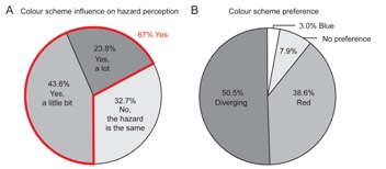
While the researchers caution against reading the results of their study as suggesting that there can be one ideal standard for volcanic hazard maps (especially given the varied needs of different stakeholders), they do believe that their results can usefully inform future map designs. “[This has] a lot of exciting implications for the way we communicate probabilistic volcanic hazards… and we do want to do more research into it” says Thompson.
Amy Donovan of the University of Cambridge, who studies volcanic risk and who was not involved in the research, told Geoscientist: “This is an interesting paper that addresses an important topic in applied volcanology”. Highlighting its impressive level of detail, Donovan said the study “will be helpful for other workers in the field who wish to ensure that probabilistic maps are effective.”
“Engaging with stakeholders, using a bottom-up approach, can clearly complement and enhance top-down approaches to volcanic hazard mapping, making the science - and the maps produced - more relevant and useful,” said Carina Fearnley of Aberystwyth University who researches environmental hazards.
 Noting that such communication issues are not often discussed, she said: “The findings ... demonstrate the important role interdisciplinary studies can bring to traditional topics such as mapping; to help deconstruct perceptions of what maps are, and how they are used, and make sure that hazard maps make use of all knowledge and technologies available to benefit all vulnerable populations.”
* Ian Randall is a science writer based in New Zealand
Reference
Mary Anne Thompson, Jan M Lindsay and JC Gaillard, 2015: The influence of probabilistic volcanic hazard map properties on hazard communication. Journal of Applied Volcanology 4.6, 11 February 2015 doi:10.1186/s13617-015-0023-0 W: www.appliedvolc.com/content/4/1/6/abstract.